Atomic Design: Breaking Up is Hard to Do, Enter Compound Components! (pt 1)
If you've been around the frontend development scene for a while, you'd likely be familiar with Atomic Design. You know, that slick, really systemized approach to building UI components to make everything feel and look modular, reusable, and oh-so consistent. And it really does deliver on these expectations — at least in simpler projects where design and interactions are rather straightforward.
But what happens when things get a little more complex? When your UI goes beyond being a mere collection of buttons and input fields, becoming a dynamic, interactive system that must adapt and respond to users in ways that Atomic Design likely didn't foresee? That is where the cracks start appearing.
In this article series, we're going to dive into those cracks. We will get a closer look at the shortcomings of Atomic Design for more complex and demanding UIs. But don't worry — we are not here to just highlight the problems. We'll also introduce you to the Compound Components pattern, which is an even more flexible approach that might just be what you need. By the end of this, at worst, you will realize how Compound Components can help you deal with state, handle interactions, and keep your code as clean and scalable as possible — even when your UI is anything but simple.
What Problem Does Atomic Design Try to Solve?
Before we do a deep dive we have to take a step back and appreciate what Atomic design originally set out to do. We’ve all been there — you open up a project with a UI that looks like it was designed by five different people, all with different ideas of what consistency means. Buttons don’t match, input fields are everywhere, and every page feels like a new adventure… in chaos. Atomic Design as conceived by Brad Frost was the silver bullet to change all that.
Basically, Atomic Design deals with creating consistency and modularity in your UI. It means breaking the interface down to its very smallest building blocks, inspired by how matter is constructed in the real world. Just like in chemistry, where atoms combine into molecules and those molecules come together to create organisms, atomic design uses these terms for different levels of UI components. Atoms would be your basic, indestructible elements: things such as buttons or input fields. Molecules would be groups of atoms and would be something like a form label paired with an input field. Therefore, organisms would be more complex structures, like, for instance, a whole form with multiple molecules performing together. This way, in thinking through every little piece of your UI, all the pieces will be reusable and fit together predictably. While this is wonderful as a philosophy, UI design just doesn't always lend itself to being that cut-and-dried in the real world. User interfaces more often call for flexibility, adaptability, and dynamic interactions that don't normally fit within predefined categories. To this end, the very rigid structure of atomic design sometimes tends to fall a little short at dealing with more subtle and complex demands made upon modern UI development.
The limits of Atomic Design
Atomic Design is a really nice starting point when looking to create consistent, modular UI components, but it's definitely not perfect — especially when you need to cope with all the messy realities of modern web apps. The problem here is it's a bit too rigid. On paper, the whole idea that atoms form molecules and molecules manifest as organisms is nice, but when your UI needs to be flexible and responsive to real-world interactions, this strict hierarchy can start to feel a bit like a straightjacket.
One of the biggest headaches has to do with state and dynamic behavior. UIs rarely exist in a static vacuum; they need to be dynamic, responsive, and sometimes behave a little jig based on the whims of a user. Take for instance, a form. How would an Atomic Design structure break this down? Well, it'd go: the form itself as an organism; the form fieldset as molecules; and the individual input elements as atoms.
We start with a Input field
// Atom: TextInput.tsx
import type { ChangeEvent } from 'react'

interface TextInputProps {
  value: string
  onChange: (e: ChangeEvent<HTMLInputElement>) => void
}

export function TextInput({ value, onChange }: TextInputProps) {
  return <input type="text" value={value} onChange={onChange} />
}
A Form field will render the Input field
// Molecule: FormFields.tsx
import type { ChangeEvent, Dispatch, SetStateAction } from 'react'
import { TextInput } from './TextInput'

interface FormFieldsProps {
  formData: { name: string; email: string }
  setFormData: Dispatch<SetStateAction<{ name: string; email: string }>>
}

export function FormFields({ formData, setFormData }: FormFieldsProps) {
  return (
    <>
      <TextInput value={formData.name} onChange={(e) => setFormData({ ...formData, name: e.target.value })} />
      <TextInput value={formData.email} onChange={(e) => setFormData({ ...formData, email: e.target.value })} />
    </>
  )
}
And at the top level, we have the Form organism that renders the FormFields molecule and manages the form state
// Organism: Form.tsx
import type { ChangeEvent, Dispatch, SetStateAction } from 'react'
import { FormFields } from './FormFields'

interface FormProps {
  formData: { name: string; email: string }
  setFormData: Dispatch<SetStateAction<{ name: string; email: string }>>
}

export function Form({ formData, setFormData }: FormProps) {
  return (
    <form>
      <FormFields formData={formData} setFormData={setFormData} />
      <button type="submit" disabled={!formData.name || !formData.email}>
        Submit
      </button>
    </form>
  )
}
But what if you need the form to validate input fields, display error messages, disable submittal until certain conditions are met? It gets exhausting managing all these interactions across different layers. You find yourself having state management scattered between the form molecule and the modal organism — exactly where tangled logic and a rigid structure that is hard to maintain comes from.
The Input now gets an extra prop for the error
// Atom: TextInput.tsx
import type { ChangeEvent } from 'react'
interface TextInputProps {
value: string
onChange: (e: ChangeEvent<HTMLInputElement>) => void
error?: string
}
export function TextInput({ value, onChange, error }: TextInputProps) {
return (
<>
<input type="text" value={value} onChange={onChange} />
{error && <span className="error-message">{error}</span>}
</>
)
}
The FormFields molecule now maps this error object to the TextInput component
// Molecule: FormFields.tsx
import type { ChangeEvent, Dispatch, SetStateAction } from 'react'
import { TextInput } from './TextInput'

interface FormFieldsProps {
  formData: { name: string; email: string }
  setFormData: Dispatch<SetStateAction<{ name: string; email: string }>>
  errors: { name?: string; email?: string }
}

export function FormFields({ formData, setFormData, errors }: FormFieldsProps) {
  return (
    <>
      <TextInput value={formData.name} onChange={(e) => setFormData({ ...formData, name: e.target.value })} errors={errors?.name} />
      <TextInput value={formData.email} onChange={(e) => setFormData({ ...formData, email: e.target.value })} errors={errors.email} />
    </>
  )
}
While the Form organism now has to manage the form validation logic
// Organism: Form.tsx
import { type ChangeEvent, type Dispatch, type SetStateAction, useState } from 'react'
import { FormFields } from './FormFields'

interface FormProps {
  formData: { name: string; email: string }
  setFormData: Dispatch<SetStateAction<{ name: string; email: string }>>
}

export function Form({ formData, setFormData }: FormProps) {
  const [errors, setErrors] = useState<{ name?: string; email?: string }>({})

  const validate = () => {
    const newErrors: {
      name?: string
      email?: string
    } = {}

    if (!formData.name) {
      newErrors.name = 'Name is required'
    } else {
      delete newErrors.name
    }

    if (!formData.email) {
      newErrors.email = 'Email is required'
    } else {
      delete newErrors.email
    }

    setErrors(newErrors)
    return Object.keys(newErrors).length === 0
  }

  const handleSubmit = (e: FormEvent) => {
    e.preventDefault()
    const isValid = validate()
    if (isValid) {
      // submit form
    }
  }

  return (
    <form onSubmit={handleSubmit}>
      <FormFields formData={formData} setFormData={setFormData} errors={errors} />
      <button type="submit" disabled={!formData.name || !formData.email}>
        Submit
      </button>
    </form>
  )
}
This undermines the very purpose of reusability and modularity that Atomic Design is supposed to serve with such changes to a number of high-impact components in order to extend or adjust form behavior.
Then, there is the question of relationships between components. Your app's going to grow, and before you know it, you realize that you are drowning in tones of repetitive code or, even worse, some overly complicated component hierarchies that become a headache to handle. It doesn't stop there — managing different styles or variations of the same component can add another layer of complexity. The places where atomic design can get overly rigid are in supporting multiple themes, sizes, or interactive states; it's quite difficult to maintain consistency without repeating a lot of code or convoluted overrides. The tight structure that Atomic Design provides gives you a very good framework to get started, but sometimes boxes you in on things that really need to be flexible or adaptive for a project.
Lessons from Atomic Design
Although atomic design has its shortcomings, it has endowed us with experience to move forward into other design patterns. First and foremost, it brings out the importance of structure and hierarchy in UI development. Breaking interfaces down into smaller manageable components allows atomic design to help us think more systematically about how to build and organize our UIs. This approach not only engenders consistency, but makes the codebase easier to comprehend and maintain as a whole.
Another critical takeaway is reusability. Atomic Design advises us that elements should be created for many different uses across different parts of an application. This is a fundamental principle of design systems: encouraging re-use of components, removing duplication, and helping to keep consistency in the design throughout a project. While the tight hierarchy that Atomic Design enforces doesn't work for more complex projects very often, the idea itself—making elements which can be reused—remains at the heart of good UI design.
Finally, Atomic Design makes one realize the importance of consistency. Visual design, behavior, or the way components are structured — it leads to a more intuitive and predictive user experience when it is consistent. While the very rigid structure of Atomic Design might not work best in all scenarios, such key principles that it places its emphasis on are things which can be applied to other, more flexible design patterns.
Atomic Design vs Compound patterns, it is just an extension of atomic design
From my experience, Atomic Design proved to be an excellent basis for creating UI components. It is very robust because it categorizes the elements on atoms, molecules, organisms, templates, and pages. At the same time, this makes it easier to construct consistent reusable components. However, as applications grow in complexity, the rigid nature of Atomic Design can start to feel restrictive. That's where Compound Components come in — they take the foundation Atomic Design provides and extend it to offer more flexibility and adaptability.
Compound Components, which are based on the Composite Pattern in software development, take the idea of grouping individual objects into tree structures and apply it to frontend development. In this pattern, the parent component plays a central role, managing shared state and logic, while child components handle specific tasks like rendering content or handling user input.
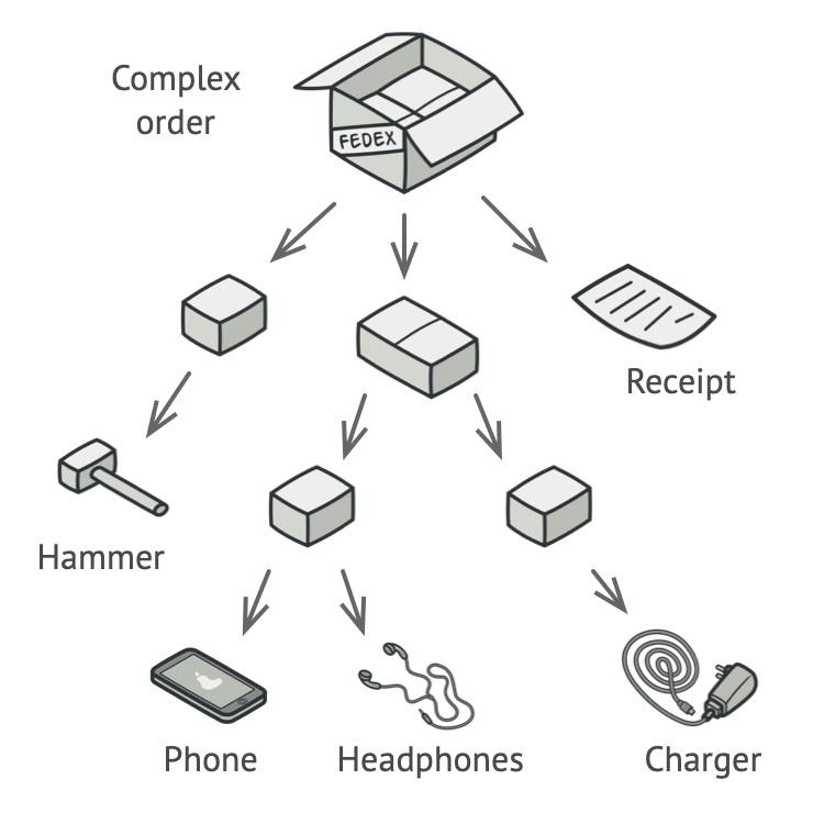
As seen in this example we see a complex order contains multiple boxes, each containing their own items inside. A box on itself can contain a new box, following the composite pattern. In the end a box can contain a single item, which is the leaf of the tree.
The main difference-and where Compound Components improve on Atomic Design-is in how they handle the relationships between components. In Atomic Design, components are often defined as isolated pieces that fit into strict categories, but Compound Components focus on how those pieces interact with each other. Instead of rigidly following predefined levels, Compound Components let state and behavior flow naturally between parent and child components, giving you a much more dynamic and flexible system.
So, while Compound Components won’t replace Atomic Design, it enhances it. It takes the strong foundation of structure and consistency and layer in the flexibility needed to handle the growing complexity of modern web applications. It’s about building a system that not only looks good on paper but also works smoothly in the real world.
Getting to Know the Compound Pattern
The reason the Compound Pattern works so well in React is because it makes your components more flexible and easier to manage. Because the parent component is managing state and business logic, the children can focus on their specific roles without concern of how everything ties together. That simplifies things and moves you away from this commonly experienced problem in React called "prop drilling", where you end up passing props through multiple layers of components just to get data from one place to another.
Let’s break it down with a simple example in React using a Tabs component
We'll create the Tabs component, which manages the shared state (active tab) and makes it available via TabsContext (exported by a hook useTabs).
// Tabs.tsx
import { createContext, useState, type PropsWithChildren } from 'react'

interface TabsContextProps {
  activeTab: string
  setActiveTab: (index: string) => void
}

// Create the context to hold the active tab state and setter function
const TabsContext = createContext<TabsContextProps | undefined>(undefined)

export function useTabs() {
  const context = useContext(TabsContext)

  if (!context) {
    throw new Error('useTabs must be used within a Tabs component')
  }

  return context
}

interface TabsProps {
  defaultValue?: string
}

// Tabs component manages the state and provides context to its children
export function Tabs({ children, defaultValue }: PropsWithChildren<TabsProps>) {
  const [activeTab, setActiveTab] = useState(defaultValue)

  return (
    <TabsContext.Provider value={{ activeTab, setActiveTab }}>
      <div className="tabs">{children}</div>
    </TabsContext.Provider>
  )
}
The TabsList will act as a container for the TabTrigger components, and TabTrigger will handle switching between tabs.
// TabsList.tsx
export function TabsList({ children }: PropsWithChildren) {
  return (
    <div role="tablist" className="tabs-list">
      {children}
    </div>
  )
}
The TabList needs a TabTrigger component to handle the tab switching
// TabTrigger.tsx
import { useTabs } from './Tabs'

interface TabTriggerProps {
  value: string
}

export function TabTrigger({ value, children }: PropsWithChildren<TabTriggerProps>) {
  const { activeTab, setActiveTab } = useTabs()

  return (
    <button role="tab" aria-selected={activeTab === value} aria-controls={`panel-${value}`} id={`tab-${value}`} onClick={() => setActiveTab(value)} className={`tab-trigger ${activeTab === value ? 'active' : ''}`}>
      {children}
    </button>
  )
}
And finally, the TabsContent component will render the content of the active tab
// TabsContent.tsx
import { useTabs } from './Tabs'

interface TabsContentProps {
  value: string
}

export function TabsContent({ value, children }: PropsWithChildren<TabsContentProps>) {
  const { activeTab } = useTabs()

  return activeTab === value ? (
    <div role="tabpanel" aria-labelledby={`tab-${value}`} id={`panel-${value}`}>
      {children}
    </div>
  ) : null
}
When putting this all together, you get a flexible and dynamic Tabs component that can be easily customized and extended to fit your needs.
export function TabExample() {
  return (
    <Tabs defaultValue="Tab 1">
      <TabsList>
        <TabTrigger value="Tab 1">Content 1</TabTrigger>
        <TabTrigger value="Tab 2">Content 2</TabTrigger>
        <TabTrigger value="Tab 3">Content 3</TabTrigger>
      </TabsList>
      <TabsContent value="Tab 1">
        <p>Tab 1 content</p>
      </TabsContent>
      <TabsContent value="Tab 2">
        <p>Tab 2 content</p>
      </TabsContent>
      <TabsContent value="Tab 3">
        <p>Tab 3 content</p>
        <div>
          We can add any content we want here
          <img src="https://via.placeholder.com/150" alt="placeholder" />
        </div>
      </TabsContent>
    </Tabs>
  )
}
This example illustrates some of the benefits of using the Compound Component Pattern in React. By separating concerns between Tabs, TabTrigger, and TabsContent, each component focuses on a specific task while sharing state through context. Furthermore, it simplifies not only the management of complex interactions but also the flexibility in how such components could be used and further customized.
Why the Compound Pattern Works
What ends up making the Compound Component Pattern so powerful is it centralizes state management to the parent component while allowing child components to perform their specific tasks on their own. Going back to our Tabs example, the Tabs component regulates the active tab state and communicates that down to its child components TabTrigger and TabsContent via context. This design eliminates the need to use prop drilling, where props are passed through many levels. Instead, it simply provides a way for child components to easily access and consume this shared state. For example, the TabTrigger component does not need any explicit knowledge about how the tabs system works. Its only role is to fire an active tab change when clicked while the TabsContent component dynamically renders content based on the current state. This division of responsibilities fosters a clear and maintainable framework, allowing for the seamless scaling of the UI without intertwining the logic across different components. This is pretty useful when building any dynamic UI whose aim is to adopt all the possible user contexts and the user interactions.
Another strong advantage of the Compound Component Pattern is flexibility and personalization, as can be seen in the Tabs example. Given that state management is within the Tabs component, adding new TabTrigger components or TabsContent panels is remarkably easy. Every new tab works perfectly, without any additional overhead, as the parent takes care of the state updates and synchronizations. This makes customization very easy, as the children can be themed or changed without affecting the bigger picture. Another advantage provided by the use of shared state throughout the components is the reduction in the chances of state inconsistency among different components. This approach not only enhances the readability and maintainability of code but also fosters the creation of dynamic, interactive, and scalable user interfaces that grow with the application. The ability to extend the interface with ease, while preserving consistency and managing complexity, makes the Compound Component Pattern a go-to option for constructing rich user interfaces in React applications.
Challenges of the Compound Pattern
Although the Compound Component Pattern has great flexibility in its application, this comes with several downsides. For instance, as the application grows, the complexity for managing shared state across increasing numbers of components quickly increases, which in turn can make maintenance and debugging harder. In our Tabs example, while the pattern keeps components modular, it's pretty hard to trace the shared state flow across the layers when more components and interactions are involved. This pattern also introduces a rather increased learning curve, mainly for developers not yet well-acquainted with some advanced React concepts like context and state management. Understanding how components can communicate without explicitly passing props down can be really hard.
The other concern is type safety. However, since the shared state is very often accessed through context, ensuring that type safety is strong in each component becomes even more cumbersome with TypeScript. Mistakes in types or state can lead to runtime errors, and tracking them at development time becomes so much more difficult.
Lastly, this pattern may not always work well with deeply nested components or fragments, where context may not propagate cleanly, leading to broken functionality or unexpected behavior. Managing these nested layers requires careful structuring to avoid issues, which can complicate the implementation even further.


 Frameworks at Crossroads Europalaan 93, 3526 KP Utrecht