Atomic Design: Breaking Up is Hard to Do, Enter Compound Components! (pt 2)
This article is part of a series. If you have not read the first part be sure to check it out here
Breaking Down the Thought Process
When working on large, complex UI designs, it’s easy to feel overwhelmed by the sheer number of components and interactions that need to be managed. The more the design grows, the more complex it becomes, and suddenly, what started off as a quite straightforward project became a tangled mess of state management, props, and tightly-coupled components. There's where so many developers and designers have hit a wall: How do you hold up flexibility and scalability without sacrificing clarity or control?
The Compound Components pattern offers a way out of this maze, but it comes with its own set of challenges. It’s not just about building components; it’s about understanding how they fit together, how they should communicate, and how to structure them so that they remain flexible as your project evolves. This thought process can be difficult to master, especially when you’re dealing with the demands of a large design system.
In this section, I'll break out, step by step, how I approach these challenges. We'll see how to deconstruct complex designs into manageable pieces, how to handle state and logic without losing your mind, and how to design APIs that make your components easy to use and extend. I hope to make the Compound Components pattern more accessible, helping you to confidently apply it to even the most challenging projects.
Understanding the Requirements
To effectively employ the Compound Components pattern, first you have to deeply know the requirements of your UI. Now, this may go without saying, but in the rush to start writing code, it usually gets overlooked. Before you start to write a line of code, take a step back and evaluate what your interface needs to pull off. What are the key interactions and behaviors? How will different components have to communicate with each other? It's good to know and understand these needs upfront, as it sets the base for all that would follow. Below are some personal tips that have helped me to deconstruct and manage complex UI projects effectively:
Begin with the User Experience: Understanding of the user journey is a UX designer's primary responsibility, yet that does not mean developers can't or shouldn't be involved. Contributing to UX design allows developers to provide their valuable insight and see what helps in creating components that truly meet the user's needs. For example, at Schiphol, we’ve They achieved great success by having UX designers and developers frequently meet and discuss emerging user needs and features. This collaboration allows us to align our visions, so that what is designed and what is technically implemented are feasible and optimized. By focusing on user interactions and early feedback, it is possible to highlight the really necessary components and understand how they should behave, thereby allowing for easier development and more consistency across the user experience.
Break down big pictures: Once the user journey has been identified, break big pictures down into more digestible pieces. Identify major components in each interaction. For instance, on a form, consider every single input field and buttons validation messages are separate components, and it shows their relationships to each other, as well as how they might Work together, hence, you are able to plan their interaction. This way, it not only indicates how different components are related and how they work in relation to one another but also may help you to see variations and states that each of these subcomponents may take various forms. It is this foresight that inspires one to craft more robust and adaptable subcomponents, and thus permit the easier development and management of larger, more complex components. The clarity of such , The relationships and behavior of components will, in turn, allow your UI to be changed much more easily, even when requirements Change.
Define Component Responsibilities: Explain what each part is supposed to do. A common mistake is giving too much responsibility to one component, which makes it harder to take care of and improve. By clearly explaining roles — like having a single main component in charge of the form's state while its smaller parts handle specific input activities, you can create a structure that is easier to manage and organize.
Plan for flexibility: Consider how your components might need to evolve. Ask yourself: How can these components be reused in different contexts? What level of customization is necessary? By planning for flexibility, you can design components that easily adapt to new needs, with minimal need for future major overhauls.
Document Your Thought Process: It might sound tedious, but documenting your thought process can be incredibly valuable. Write down the requirements you’ve identified, the interactions you’re planning for, and the roles of each component. This not only keeps you focused but also makes it easier to communicate your design decisions with your team.
How to identify reusable components
Think of designing UI components like putting together a car. A small component, like a tire or a steering wheel, is pretty simple and understandable in functionality. But when you start looking at a car as a whole, it’s made up of many different parts working together. The key to building an efficient vehicle lies in recognizing which parts can be reused across different models. Similarly, in UI design, smaller components like buttons are straightforward, but when you encounter larger, more complex elements, like a fully designed card, the challenge is breaking it down into reusable parts that can fit into other sections of your “vehicle.”
Let's break down a card component into smaller, reusable parts. This example is from our Schiphol website and design system.

Compared to other interactive active components, such as tabs that involve active states and user input handling, this is a purely presentational component. This avoids complicated state management but offers invaluable lessons in how best to structure and arrange content in a consistent, reusable manner. The Card has two main, well-defined regions: the header and the content. Both are designed for specific purposes and include specific layout directives that foster flexibility in various applications while ensuring continuity.
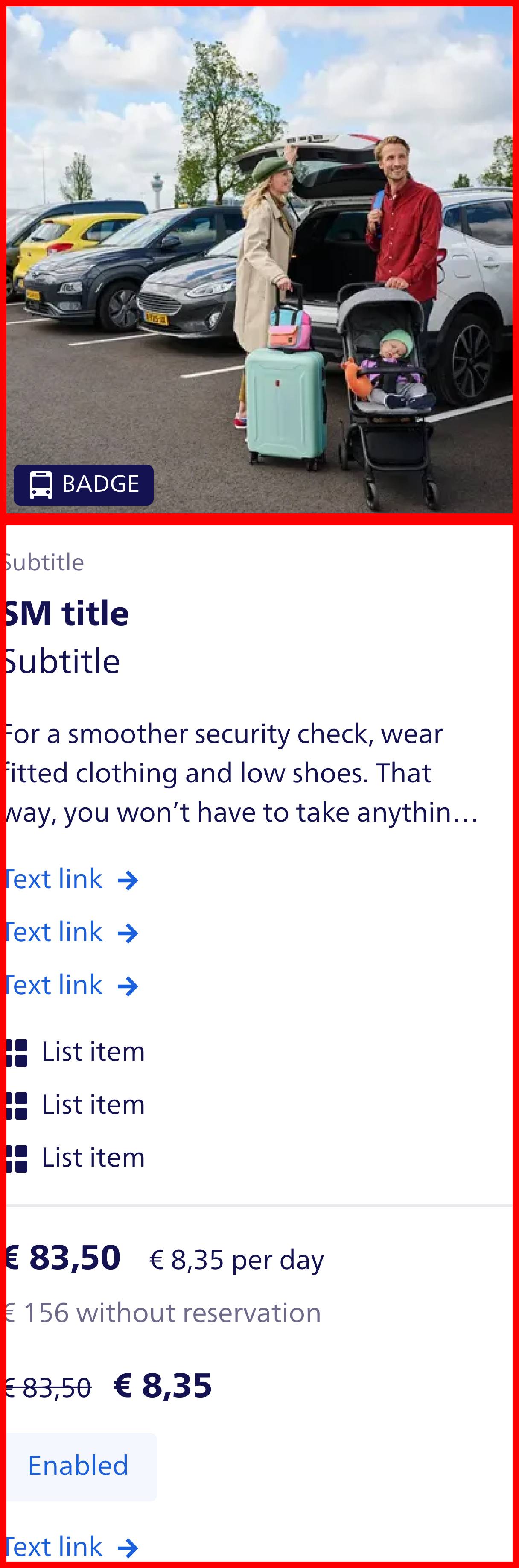
Card header
Starting with the header, there are two key elements: an image and a badge. The image is the dominant visual asset, and it typically spans the width of the card, providing a strong visual hook. The badge, on the other hand, acts as a label or status indicator and is consistently positioned in the same fixed spot—usually in one of the corners of the image. This badge placement ensures that, no matter the variation in content or image size, the badge remains visible and clearly conveys important information to the user.

Header in code
Let's first create a Badge component. In the example I'm using a forwardRef function that enables the use of Polymorphic components. This allows the Badge component to be rendered as a span by default but can be changed to a different element, like a div, if needed. This flexibility ensures that the Badge component can be easily adapted to different layouts and designs without having to create multiple components for each variation. If you want to read more about Polymorphic components, check out this article.
import { cloneElement, type ReactElement } from 'react'

import { cx } from 'class-variance-authority'

import { forwardRef } from '../helpers' // A helper function to type forwardRef and create a Polymorphic component
import { badgeVariants, type BadgeVariantsProps } from './badge-variants' // Styles for different badge variants

export interface BadgeProps extends BadgeVariantsProps {
  icon?: ReactElement // Icon to display in the badge, optional
}

const defaultAs = 'span' as const

/**
 * Badges are used to display a small amount of information, such as a discount or status.
 * Extends the native `span` element.
 *
 * @param variant - Button intent (primary, privium, discount), default is `default`
 * @param icon - Icon to display in the badge
 * @param children - Content to display in the badge
 * @param as - Element to render as, defaults to `span`
 * @param ref - Forwarded ref
 *
 * @example
 * ```
 * <Badge variant="default">New</Badge>
 * ```
 *
 * @example
 * ```
 * <Badge variant="privium" icon={<Icon />}>Privium</Badge>
 * ```
 */
export const Badge = forwardRef<BadgeProps, typeof defaultAs>(({ children, className, icon, variant = 'default', as = defaultAs, ...props }, ref) => {
  const Component = as

  return (
    <Component ref={ref} {...props} className={cx(badgeVariants({ variant }), className)}>
      {icon ? (
        <>
          {cloneElement(icon, {
            width: 16,
            height: 16,
          })}
        </>
      ) : null}
      {children}
    </Component>
  )
})

Badge.id = 'Badge' // Unique identifier for the component for rendering in Compound Components
Badge.displayName = 'Badge' // Display name for the component in React DevTools
Resulting in the Badge component
Next is the Image component. The Image component is a simple wrapper around the native img element, but can be adjusted with the Polymorphic component option.
import { twMerge } from 'tailwind-merge'

import { forwardRef } from '../helpers' // A helper function to type forwardRef and create a Polymorphic component
import { imageVariants, type ImageVariantsProps } from './image-variants' // Styles for different image variants

export interface ImageProps extends ImageVariantsProps {}

const defaultAs = 'img' as const

/**
 * Image component for displaying images.
 * Extends the native `img` HTML element.
 *
 * @param ratio - Aspect ratio of the image (square, 3:2, 1:1), default is `square`
 * @param fit - Image fit (contain, cover), default is `cover`
 * @param ref - Forwarded ref
 *
 * @example
 * ```
 * <Image src="/path/to/image.jpg" alt="Description of image" />
 * ```
 *
 * @example
 * ```
 * <Image src="/path/to/image.jpg" alt="Description of image" ratio="3:2" />
 * ```
 */
export const Image = forwardRef<ImageProps, typeof defaultAs>(({ children, fit = 'cover', ratio = 'square', className, as = defaultAs, ...props }, ref) => {
  const Component = as

  return (
    <Component ref={ref} {...props} className={twMerge(imageVariants({ ratio, fit }), className)}>
      {children}
    </Component>
  )
})

Image.id = 'Image' // Unique identifier for the component for rendering in Compound Components
Image.displayName = 'Image' // Display name for the component in React DevTools
Resulting in the Image component

Now we can create the CardHeader component. The CardHeader component is a simple container that holds the Image and Badge components. It is designed to be flexible and can be easily customized to fit different layouts and designs.
import { cloneElement } from 'react'

import { cx } from 'class-variance-authority'

import { filterChildrenOnId, forwardRef, getValidChildren, mapChildren } from '../../helpers' // Helper functions for filtering, mapping, and validating children

export interface CardHeaderProps {}

const defaultAs = 'div' as const

/**
 * Card header is used to display the main header of a card.
 * Used in combination with the `Card` component and `Image` and `Badge` components.
 *
 * @param children - The content to display in the card header.
 * @param as - The element to render the card header as. Defaults to a div tag.
 * @param ref - The ref to attach to the card header.
 *
 * @example
 * ```
 * <CardHeader>
 *  <Image src="https://via.placeholder.com/450x500" alt="placeholder" />
 * </CardHeader>
 * ```
 *
 * @example
 * ```
 * <CardHeader>
 *  <Badge variant="default">Badge</Badge>
 *  <Image src="https://via.placeholder.com/450x500" alt="placeholder" />
 * </CardHeader>
 * ```
 */
export const CardHeader = forwardRef<CardHeaderProps, typeof defaultAs>(({ children, className, as = defaultAs, ...props }, ref) => {
  const Component = as
  const validChildren = getValidChildren(children) // Filter out invalid children (null, undefined, etc.)

  // Apply classes to children
  const clones = mapChildren(validChildren, (child) => {
    switch (child.type.id) {
      case 'Badge':
        return cloneElement(child, {
          className: cx(
            'absolute bottom-050 left-050 z-10', // Position the badge in the bottom left corner
            child.props?.className,
          ),
        })

      default:
        return null
    }
  })

  return (
    <Component ref={ref} {...props} className={cx('relative flex', className)}>
      {filterChildrenOnId(clones, ['Badge'])}
      <div className="relative w-full overflow-hidden rounded-small">{filterChildrenOnId(clones, ['Image'])}</div>
    </Component>
  )
})

CardHeader.id = 'CardHeader'
CardHeader.displayName = 'CardHeader'
Card content
Below the header, the content section consists of a collection of multiple items that follow a structured layout. All cards feature a title, which for this content section is a required component. The opposite is true for the subtitle, which may optionally appear. It might show up underneath the title on a particular card variation, or lower in the card - perhaps underneath supplemental text or a list of items. Each possible placement of the subtitle comes with its own styling rules, ensuring that even though the placement varies, the card maintains visual consistency and readability. Within the content section the developer can add any predefined content, such as a list of items, a paragraph of text, or a button. These content items are flexible and can be arranged in any order, allowing for a variety of card layouts while maintaining a consistent visual style.
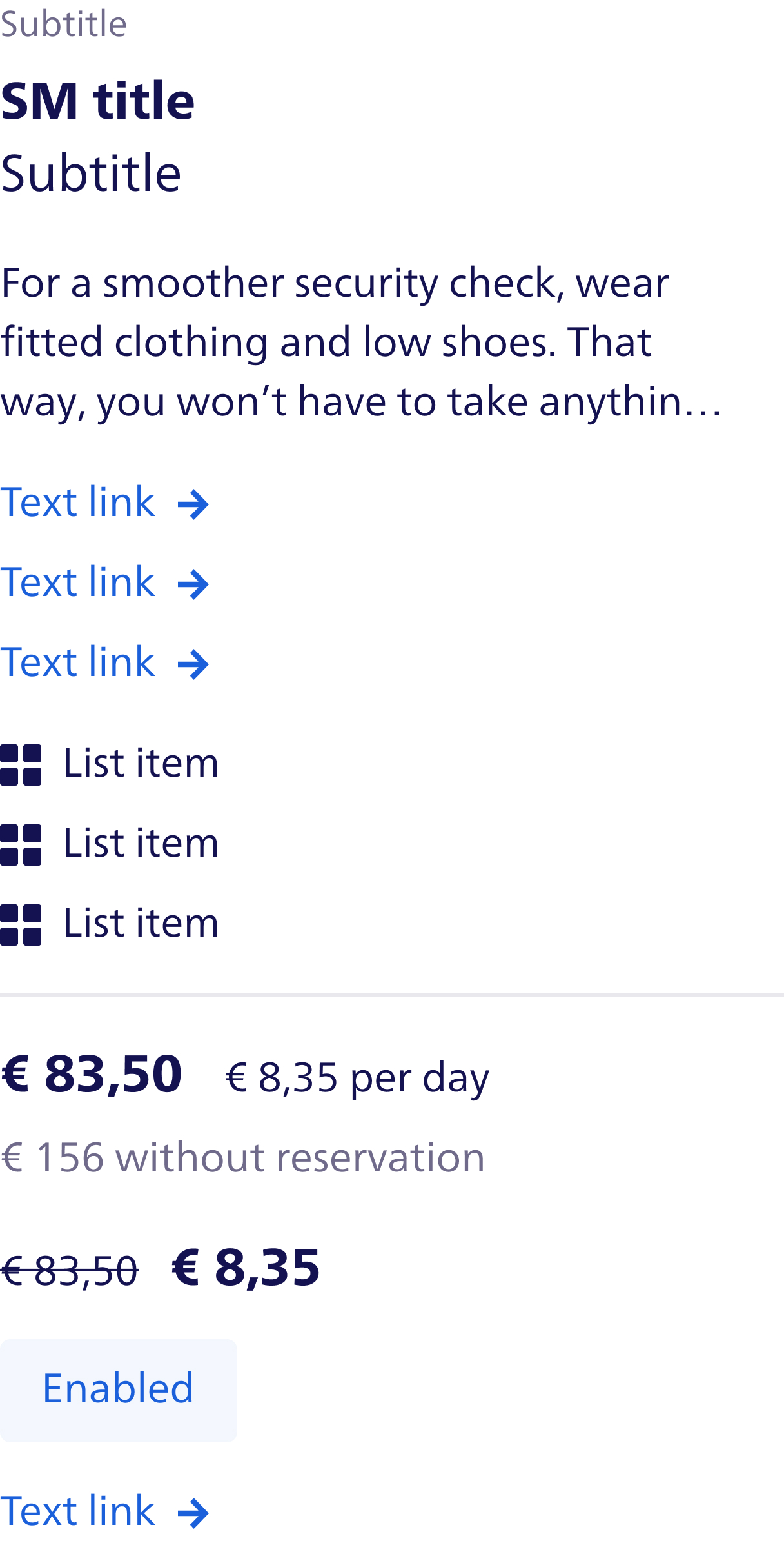
One of the most important aspects of the content section is the fact that every element, starting from the text links down to the list items to price information, all have a fixed spacing and layout structure. For instance, each text link and each list item has equal spacing between the elements, which makes them neat and organized. These fixed spacings and alignments are important in maintaining the integrity of the card when the amount of its content may change. A clearly defined layout grid or utility-based spacing—such as margin or padding classes—will ensure these elements always remain consistent, regardless of the content. CSS grid or flexbox is a great choice for handling this layout because it provides the necessary structure but keeps the code modular and adaptable.
Finally, the Card component. The Card component is the main container that holds the CardHeader and CardContent components. It is designed to be flexible and can be easily customized to fit different layouts and designs.
import { cloneElement } from 'react'

import { cx } from 'class-variance-authority'

import { filterChildrenOnId, forwardRef, getValidChildren, mapChildren, sortChildren } from '../helpers' // Helper functions for filtering, mapping, and validating children
import { cardHeaderVariants, type CardHeaderVariantsProps } from './header/card-header-variants' // Styles for different card header variants

export interface CardProps extends CardHeaderVariantsProps {}
const defaultAs = 'section' as const

/**
 * A card is used to display content in a structured manner.
 * Used in combination with the `CardHeader` and `CardContent` components.
 *
 * @param children - The content to display in the card.
 * @param as - The element to render the card as. Defaults to a section tag.
 * @param ref - The ref to attach to the card.
 *
 * @example
 * ```
 * <Card>
 *  <CardHeader>
 *    <Image src="https://via.placeholder.com/450x500" alt="placeholder" />
 *  </CardHeader>
 *  <CardContent>
 *    <CardTitle>Title</CardTitle>
 *    <CardSubTitle>Sub Title</CardSubTitle>
 *    <Paragraph>
 *      For a smoother security check, wear fitted clothing and low shoes.
 *      That way, you won’t have to take anything off.
 *    </Paragraph>
 *  </CardContent>
 * </Card>
 * ```
 */
export const Card = forwardRef<CardProps, typeof defaultAs>(({ children, className, as = defaultAs, background = 'on-white', intent = 'default', ...props }, ref) => {
  const Component = as
  const validChildren = getValidChildren(children)

  // Apply classes to children (mainly image)
  // We always place the CardContent first, then the CardHeader
  // Filter the children to only include CardContent and CardHeader
  const clones = sortChildren(
    filterChildrenOnId(
      mapChildren(validChildren, (child) => {
        switch (child.type?.id) {
          case 'CardHeader':
            return cloneElement(child, {
              className: cx('rounded-small', cardHeaderVariants({ background, intent }), child.props?.className),
            })
          default:
            return child
        }
      }),
      ['CardContent', 'CardHeader'],
    ),
    (a, b) => {
      if (a.type.id === 'CardContent') {
        return -1
      }
      if (b.type.id === 'CardContent') {
        return 1
      }
      return 0
    },
  )

  return (
    <Component ref={ref} {...props} className={cx('group flex flex-col-reverse no-underline', 'focus:outline-color-border-focus-on-white', 'focus:border-color-border-focus-on-white', 'outline-none outline-offset-0 focus:outline', className)}>
      {clones}
    </Component>
  )
})

Card.id = 'Card' // Unique identifier for the component for rendering in Compound Components
Card.displayName = 'Card' // Display name for the component in React DevTools
With a full understanding of how this card is structured, let's think about how the API for this component would Look in a frontend application. Since a card is divided into reusable sections, header, badge, image, title, subtitle, and content, all of which can be passed as props or child components to easily customize and render various variations in the card. For instance, a possible API for rendering this card could look like this:
export function Card() {
  return (
    <Card>
      <CardHeader>
        <Badge variant="default">Badge</Badge>
        <Image alt="placeholder" src="https://via.placeholder.com/450x500" />
      </CardHeader>
      <CardContent>
        <CardSubTitle>Sub Title</CardSubTitle>
        <CardTitle>Title</CardTitle>
        <Paragraph>For a smoother security check, wear fitted clothing and low shoes. That way, you won’t have to take anything off.</Paragraph>
        <List>
          <ListItem>
            <TextLink icon={<ArrowRight />}>List Item</TextLink>
          </ListItem>
          <ListItem>
            <TextLink icon={<ArrowRight />}>List Item 2</TextLink>
          </ListItem>
        </List>
        <List>
          <ListItem icon={<Categories />}>List Item</ListItem>
          <ListItem icon={<Categories />}>List Item 2 Lorem ipsum dolor sit amet, consectetur adipisicing elit. Explicabo tempora consequatur nulla ut ab nemo? Quidem mollitia perferendis adipisci accusantium alias numquam debitis iusto explicabo. Ullam ipsa placeat laborum qui.</ListItem>
        </List>
        <Divider />
        <ButtonGroup>
          <Button intent="primary">Book here</Button>
          <TextLink href="#" icon={<ArrowRight />}>
            More info
          </TextLink>
        </ButtonGroup>
      </CardContent>
    </Card>
  )
}
Accordingly, this API allows for a high degree of customization and flexibility to the developer for making various types of cards. variations without rewriting the whole component. Breaking the card down into smaller, reusable components allows for Each of them plays a particular role, by which we can easily manage the complexity of the card and maintain its coherence. versatile, and adaptable for various applications.
By this setup we can easily create variations of the card with different content, layouts, or styles, without having to rewrite the whole component. For example:
An article card

export function ArticleCard() {
  return (
    <Card>
      <CardHeader>
        <Image alt="placeholder" ratio="3:2" src="https://via.placeholder.com/450x500" />
      </CardHeader>
      <CardContent>
        <CardSubTitle>Sub Title</CardSubTitle>
        <CardTitle>Article example</CardTitle>
        <Paragraph>For a smoother security check, wear fitted clothing and low shoes. That way, you won’t have to take anything off.</Paragraph>
        <Button intent="tertiary">Book here</Button>
        <TextLink href="#" icon={<ArrowRight />}>
          More info
        </TextLink>
      </CardContent>
    </Card>
  )
}
A product card

export function ProductCard() {
  return (
    <Card>
      <CardHeader>
        <Badge icon={<Bus />} variant="default">
          5 min
        </Badge>
        <Image alt="placeholder" src="https://via.placeholder.com/450x500" />
      </CardHeader>
      <CardContent>
        <CardTitle>Title</CardTitle>
        <List>
          <ListItem icon={<Euro1 />}>Most cost efficient</ListItem>
          <ListItem icon={<ClockFill />}>Long stay (min. 8hrs)</ListItem>
          <ListItem icon={<Baggage />}>Baggage loading point</ListItem>
        </List>
        <Divider />
        <div className="flex flex-wrap items-center gap-x-gap-lg gap-y-gap-sm">
          <Heading size="sm">€ 83,50</Heading>
          <Paragraph size="base">€ 8,35 per day</Paragraph>
          <Paragraph className="w-full text-color-text-tertiary" size="base">
            € 156 without reservation
          </Paragraph>
        </div>
        <Button intent="primary">Book here</Button>
        <TextLink href="#" icon={<ArrowRight />}>
          More info
        </TextLink>
      </CardContent>
    </Card>
  )
}
And even a contact card

export function ContactCard() {
  return (
    <Card>
      <CardHeader>
        <Image alt="placeholder" ratio="1:1" src="https://via.placeholder.com/450x500" />
      </CardHeader>
      <CardContent>
        <CardTitle>John Doe</CardTitle>
        <CardSubTitle>Leasing manager</CardSubTitle>
        <List>
          <ListItem intent="link">
            <TextLink href="#" icon={<Phone />} iconPosition="left">
              +31 6 123 456 78
            </TextLink>
          </ListItem>
          <ListItem intent="link">
            <TextLink href="#" icon={<Email />} iconPosition="left">
              e-mailadres
            </TextLink>
          </ListItem>
          <ListItem intent="link">
            <TextLink href="#" icon={<Linkedin />} iconPosition="left">
              Linkedin
            </TextLink>
          </ListItem>
        </List>
      </CardContent>
    </Card>
  )
}
Conclusion
In conclusion, Atomic Design offers a systematic and modular approach to UI development by breaking down components into atoms, molecules, and organisms, ensuring consistency and reusability across projects. While this approach works well for simpler applications, its rigidity becomes a drawback when dealing with more complex UIs that require dynamic behaviors and intricate interactions. Managing state across multiple layers often leads to fragmented logic and repetitive code, complicating both scalability and maintainability.
The Compound Components pattern provides a solution to these limitations by centralizing state management in parent components, allowing child components to focus on specific tasks. This flexibility reduces the need for prop drilling, where data is passed through multiple component layers, and facilitates the development of dynamic, interactive UIs that can scale as applications grow. Although this pattern introduces challenges such as increased complexity in managing shared state and a steeper learning curve for developers, it significantly improves adaptability.
Ultimately, Atomic Design and Compound Components are not mutually exclusive but complementary. While Atomic Design lays a strong foundation of structure, hierarchy, and reusability, Compound Components enhance flexibility, allowing developers to handle modern UI complexities more effectively. Together, they enable the creation of user interfaces that are consistent, scalable, and adaptable to evolving project requirements.


 Frameworks at Crossroads Europalaan 93, 3526 KP Utrecht