Setup React + Typescript + Storybook all using the same SCSS
So ok. You found out that React is super cool. Even more cool when you’re able to use Typescript AND storybook to showcase your reusable components! This article is a fantastic base to set it all up: https://dev.to/swyx/quick-guide-to-setup-your-react—typescript-storybook-design-system-1c51 or use this github example: https://github.com/JoshSchreuder/storybook3-typescript-example .
But I’m missing something here. I’d love to be able to use the scss files used in my app to style the components in storybook the same way. Searching through all the blogs and forums, it all seems to be kinda unclear how to do so. After tweaking some bits, adding webpack config to the storybook files and even (un)ejecting React, I found out adding your global scss style is fairly simple, even though it feels like you should’nt be using it like this. How? These are the steps:
- Use the Setup guide in the link above
- Make sure you have a main .scss file used by your app plus scss support in your project
- Check your package.json for the following configuration
{
  "devDependencies": {
    "@storybook/addon-actions": "^3.4.11",
    "@storybook/addon-links": "^3.4.11",
    "@storybook/addons": "^3.4.11",
    "@storybook/react": "^3.4.11",
    "@types/classnames": "^2.2.6",
    "@types/jest": "^23.3.2",
    "@types/node": "^10.10.3",
    "@types/react": "^16.4.14",
    "@types/react-dom": "^16.0.7",
    "@types/react-test-renderer": "^16.0.2",
    "@types/storybook__react": "^3.0.9",
    "http-server": "^0.11.1",
    "testcafe": "^0.22.0",
    "babel-core": "^6.26.3",
    "babel-runtime": "^6.26.0",
    "node-sass-chokidar": "^1.3.3",
    "npm-run-all": "^4.1.3",
    "node-sass": "^4.9.3",
    "pa-test-library": "^0.1.2",
    "react-test-renderer": "^16.5.2",
    "sass-loader": "^7.1.0",
    "testcafe-browser-provider-puppeteer": "^1.3.3",
    "testcafe-live": "^0.1.3",
    "typescript": "^3.0.3"
  }
}
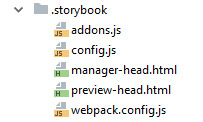
- See that you have at least these following files (of which
manager-head.htmlandpreview-head.htmlare optional):
- Add the following to your storybook webpack.config file:
const path = require("path");
const include = path.resolve(__dirname, "../");

module.exports = {
  resolve: {
    extensions: [".ts", ".tsx", ".js", ".css", ".scss"],
  },
  module: {
    rules: [
      {
        test: /\.tsx/,
        loader: "babel-loader!ts-loader",
        exclude: /node_modules/,
        include,
      },
      {
        test: /\.css$/,
        use: ["style-loader", "css-loader"],
      },
      {
        test: /\.scss$/,
        use: ["style-loader", "css-loader", "sass-loader"],
      },
    ],
  },
};
- add the following to config.js to search through your project (
../srcin our case) for your story files with certain prefix
```javascript import { configure } from "@storybook/react"; import "../src/index.scss"; const req = require.context("../src", true, /story.tsx?$/);
function loadStories() { req.keys().forEach((filename) => req(filename)); }
configure(loadStories, module); ```
- Notice this important line below! This is the main scss file you import in your storybook config to make your components look the same as in your project!
import "../src/index/scss";
- In the optional manager-head.html file you’re able to add scripts etc which will be added to the head-tag
<script>
  document.title = "Your fantastic app title - Storybook";
</script>
- In the optionial preview-head.html file you can add links like external sources like so:
<link rel="stylesheet" href="url-to-yourfavoritefont.css" />
- (Re)build your storybook and BAM! You’re good to go!


 Frameworks at Crossroads Europalaan 93, 3526 KP Utrecht