Improve accessibility for your website with five easy tips
The first thought that goes through your mind when thinking about accessibility is probably the support for blind people for the web. But this might be the most common mistake we make as frontend developers. We tend to forget disabilities like color blindness, dyslexia, deafness, blurry vision or even something as simple as standing in direct sunlight with your mobile phone, making it hard to see. We all encounter some form of accessibility impairment, even though at first we don’t even realise this problem. I’m not writing this article to talk about equality, that’s a topic for some other day. I just want to give you five easy tips to increase your website accessibility for everyday users.
Read more
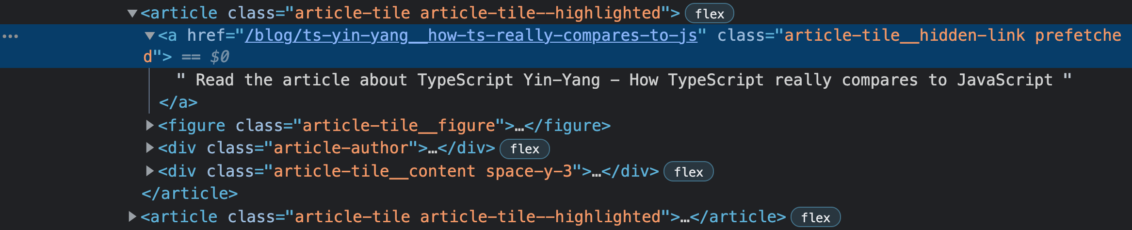
No, this header is not a link to navigate to the rest of this article. Although it is commonly used like that, it doesn’t really describe the action you are about to make. Where are you navigating towards? Context is really important here. The read more button is a follow up of an excerpt of a blog. If you skip the excerpt and navigate directly to the read more button by using the tab key, or using a screen reader you miss this context. This is a level A rule of the Web Content Accessibility Guidelines (WCAG).
In our website we use extra context for links that depend on styling. We add a full description to a link element that is styled above a full image of an article. This way we help users with a screen reader or other form of text to speech. We hide the text with CSS so we don’t impair other users.
You could also use a hidden element inside a link. Again we take the read more button as an example.
<a href="#your-target">
  Read more
  <span class="hidden">
    about the article improve accessibility for your website with five easy tips
  </span>
</a>
.hidden {
  position: absolute;
  width: 1px;
  height: 1px;
  padding: 0;
  margin: -1px;
  overflow: hidden;
  clip: rect(0, 0, 0, 0);
  white-space: nowrap;
  border-width: 0;
}
Media queries
Media queries in CSS are often known for breakpoints. The @media tag followed
by a rule captures a condition. When following these rules you can improve the
user experience. Some media queries are specifically made to increase
accessibility.
Reduce motion
As frontend developers we tend to make our website as flashy as possible. The marquee element might not be used by a lot of websites anymore, but we do prefer smooth transitions when opening a modal for example. This may come as a surprise, but not all users prefer this behaviour. Users that are more prone to distraction can disable this feature with a fairly new setting in the browser or in the operating system. The only thing remaining is to think about these users for your website.
@media (prefers-reduced-motion: reduce) {
  * {
    animation-duration: 0.01ms !important;
    animation-iteration-count: 1 !important;
    transition-duration: 0.01ms !important;
    scroll-behavior: auto !important;
  }
}
This simple CSS rule disables most of the animations and transitions. You can of course adapt this feature for each animation. But this is the fastest way of disabling transitions.
Color scheme
Changing the color scheme is one of the most known features on the web. Not only on the web this feature is available, also in cars, mobile devices and e-readers. Color schemes vary from changing the brightness, adding a sepia filter at night and more commonly known, dark mode. Dark mode has grown exponentially when it first appeared. It can help a lot of users for a more focused visit. It is also really easy to implement with a media query. Looking at you Google Search...
.day {
  background: #eee;
  color: black;
}
.night {
  background: #333;
  color: white;
}

@media (prefers-color-scheme: dark) {
  .day.dark-scheme {
    background: #333;
    color: white;
  }
  .night.dark-scheme {
    background: black;
    color: #ddd;
  }
}

@media (prefers-color-scheme: light) {
  .day.light-scheme {
    background: white;
    color: #555;
  }
  .night.light-scheme {
    background: #eee;
    color: black;
  }
}
Source: https://developer.mozilla.org/en-US/docs/Web/CSS/@media/prefers-color-scheme
Keyboard management
Don’t you love it when a modal closes when you press the escape key? Well I certainly do prefer this behaviour. But there are more things we can focus on when applying shifting layouts. For example you can shift the focus state to the close button after you open a dialog. This way a user can close it directly or navigate through the dialog.
You can listen to an escape event as follows
function handleEscapeKey(event) {
  if (event.key === "Escape") {
    // Close your modal
  }
}

document.body.addEventListener("keydown", handleEscapeKey);
Just make sure you shift the focus back on the open modal button after closing
it and destroy the eventListener again.
document.body.removeEventListener("keydown", handleEscapeKey);
A screen reader or any other form of text to speech will tell you the current
focus state. If you have a large navigation on your website try to make good use
of the tabindex. Try putting less important items on the value -1, this way
a user can skip some links if they are not relevant for them yet. This also
applies the other way around. You can increase the index to 0 to make it
accessible for keyboard users. Rather the best use of tabindex is to use
semantic HTML. Try using your website with a keyboard only and experience this
behaviour yourself.
Contrast ratio
It is time for a little quiz. Depending on some images I want you to tell me if the text has a good enough contrast compared to the background.
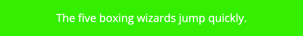
We are going to start of easy

I hope we can all agree that this text does not have a perfect contrast ratio. A dark background with a dark blue text does not match. The ratio has a score of 2.52:1, more on this later.

This one has a perfect contrast ratio. This means we can read this in more challenging situations, like outside.. It has a contrast ratio of 8.31:1.
Now it gets a bit harder. It really depends on the device you are reading this on. Even though it doesn’t look like it at first, this example has a lower contrast ratio than the first example, 1.54:1. We can increase the contrast by just making the background a little bit darker.

This makes the text more readable. Now it has a contrast ratio of 7.65:1. According to WCAG 2.0, level AA requires a contrast ratio of at least 4.5:1 for normal text and 3:1 for large text. WCAG 2.1 requires a contrast ratio of at least 3:1 for graphics and user interface components (such as form input borders). WCAG Level AAA requires a contrast ratio of at least 7:1 for normal text and 4.5:1 for large text.
You can test the contrast ratio of your own website yourself on https://webaim.org/resources/contrastchecker/.
Having a lower contrast ratio is maybe the most commonly made mistake. To be honest, I did have a lot of discussion with the designers in my team about this topic. Most of the time we work with colors based on a brand. Just remember to check the color combinations when the colors come together.
Tools
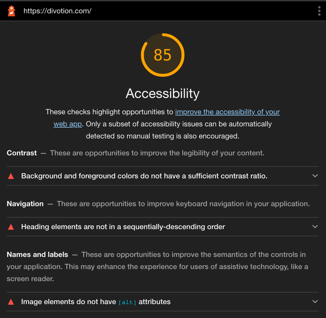
To help you increase awareness on accessibility we have amazing tools. I already mentioned the contrast checker website but take a look at the following tools. It might help you achieve a better A11Y score in Lighthouse (which is the first tool)
Lighthouse
With Lighthouse you can run an audit of your website, this also includes accessibility tips. Try running it on your website to get some quick wins. At the Divotion website we still have something to win about this part.
ESLint
ESLint can also give you advice on how to correctly implement certain HTML elements. The plugin (React, or Vue) checks for simple rules, like a type attribute on a button.
Automated tests
If you really want to take it a step further try learning more about automated tests. The axe-core engine https://github.com/dequelabs/axe-core helps you with this process
Browser extension
There are a lot of browser extensions that can help. Funkify, for example, is an extension for Chrome that helps you experience the web and interfaces through the eyes of extreme users with different abilities and disabilities.
What are you waiting for? Go apply these tips to your own website.
 Frameworks at Crossroads Europalaan 93, 3526 KP Utrecht